TL;DR: A waitlist landing page is a single web page built to capture email signups before your product launches, with a referral mechanic that turns each signup into a multiplier. The best ones share five traits — a specific outcome-driven headline, one above-the-fold CTA, visible social proof, a referral block on the success page, and mobile-first design. You can ship one in 5 minutes using a hosted tool, or embed a widget into an existing site. This guide walks through the definition, the essential components, and the exact steps to build your own.
The short definition
A waitlist landing page is a single-purpose web page designed to capture email signups before your product, feature, or service launches. It differs from a general "homepage" in three ways:
- One action. The whole page exists to get visitors to drop their email. No navigation, no secondary CTAs.
- Scarcity or early-access framing. Visitors sign up because joining means getting in before others, not because they're ready to buy.
- A referral mechanic. Signups get a unique link that moves them up the queue when friends join — making each signup a growth multiplier, not just a data point.
Waitlist landing pages are the direct evolution of the classic "coming soon page" — the core concept is identical, but the modern version adds referral loops and position tracking that can 5–10× your list growth compared to a static email-capture page.
Why a waitlist landing page matters
Three reasons founders build them before launch:
-
Validate demand before you build. Signups tell you whether the market is interested. If you launch a page and get 10 signups in 30 days, that's a signal. If you get 1000, that's a stronger signal. You learn at the cost of a single page.
-
Pre-load your launch day. Launching to an engaged audience of 2,000 beats launching to a cold audience of zero. Every person on your list is a day-one user, a reviewer, and potentially a referrer.
-
Power a viral loop. With a referral mechanic, each signup has the potential to bring more. The viral coefficient math makes this compound over weeks.
The 5 components of every high-converting waitlist landing page
Based on teardowns of 15+ real pre-launch pages — Robinhood, Superhuman, Morning Brew, and others. For visual examples, see our waitlist landing page examples post.
1. Outcome-driven headline
Name the specific benefit and the specific audience. "Commission-free trading" beats "A better way to invest." "The inbox that writes replies for you" beats "The future of email." Users scan for 2 seconds before deciding whether to keep reading.
2. One above-the-fold CTA
Email input and a button. No navigation menu. No "Learn more" link. No "About us." The best waitlist landing pages have nothing else to click — the friction of a second option drops conversion by 30%+.
3. Social proof
A live signup counter ("Join 1,243 others on the waitlist"), press logos from where you've been covered, or testimonials from early users. If you have zero signups yet, even a founder photo with a one-sentence story works. Don't invent numbers — authenticity beats inflation.
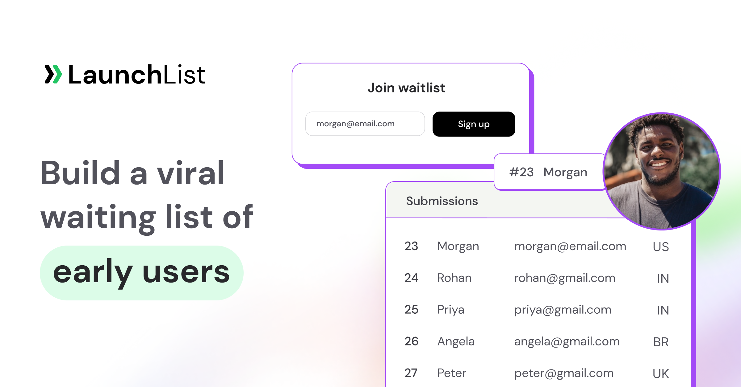
4. A referral block on the success page
After signup, the visitor sees a thank-you page with:
- Their position in line ("You're #872 of 4,107")
- A unique share link
- A leaderboard of top referrers
This is the single most important conversion element most beginners miss. Without it, your page is a one-shot email capture. With it, every signup has the potential to bring 2–5 more.
5. Mobile-first design
A majority of pre-launch traffic comes from Twitter/X, Reddit, and Indie Hackers — all mobile-heavy. The form must be thumb-friendly, the page must load under 2 seconds, and the signup flow must work with one thumb. Desktop-first designs lose half their audience before they ever see the CTA.
Waitlist landing page vs regular landing page
| Regular landing page | Waitlist landing page | |
|---|---|---|
| Product state | Live, buyable | Pre-launch, not yet available |
| CTA | "Buy now" / "Sign up / "Book demo" | "Join the waitlist" |
| Goal | Conversion to purchase or trial | Email capture with future follow-up |
| Social proof | Customer logos, reviews | Signup counter, referrer leaderboard |
| Post-signup | Checkout or trial flow | Thank-you page with referral link |
| Time to build | Days to weeks | 5 minutes with a hosted tool |
The purposes are related but not the same. A regular landing page sells; a waitlist landing page builds audience while you haven't yet finished what you're selling.
Waitlist landing page vs coming soon page
In 2026, interchangeable in most contexts. Both capture emails pre-launch. "Coming soon page" is the older, broader term; "waitlist landing page" is the modern version with referral mechanics built in. If you're searching for one, the answer you want is probably the other. See our deeper breakdown: What is a coming soon page?
How to build a waitlist landing page
Three paths, ordered by setup time:
Fastest — hosted page (5 minutes, no code)
Sign up for LaunchList, customize your page in the dashboard (headline, colors, logo, referral reward text), and share the link. Every account gets a hosted page at getlaunchlist.com/pages/your-slug. Free for your first 100 signups.
Mid — embed widget on your existing site
If you already have a Framer, Webflow, Carrd, or WordPress site, paste a one-line script tag and a widget div. Platform-specific setup guides:
- Webflow waitlist setup
- WordPress waitlist plugin setup
- Squarespace waitlist setup
- All 13+ integration docs
Slowest — custom-built
Webflow, Framer, or Next.js from scratch. Adds 2–8 hours vs the hosted option. Only worth it if you have brand requirements the hosted version can't meet, or you're A/B testing designs at scale.
Common mistakes to avoid
- Collecting too many fields. Just email. Add other fields later in the journey — first signup should be friction-free.
- No referral mechanic. Without one, you're paying for every signup individually. The loop is free to add and can double your growth.
- No post-signup page. If users hit "Submit" and see a generic thank-you, you've missed the viral moment. Show position + share link immediately.
- Too much copy. A waitlist landing page should be scannable in under 10 seconds. If someone has to scroll to understand the pitch, rewrite the headline.
- Launching without social proof. Even 20 signups is "Join 20 early users." Without a counter or testimonial, visitors assume nobody else cares.
- Not validating demand. If the page gets 200 visitors and 2 signups, you have a message problem (or a market problem). Before you scale paid traffic, fix the conversion rate.
How much does a waitlist landing page cost?
The page itself: free, if you use a hosted tool. LaunchList's free plan covers your first 100 submissions. Beyond 100, paid plans start at a one-time fee — no monthly subscription.
Design costs: zero if you use the built-in themes. A custom designer might charge $500–$2,000 for a branded design, but it's rarely necessary for pre-launch.
Traffic costs: this is where real money goes. Paid ads to a waitlist page typically cost $1–$5 per signup depending on niche. Organic traffic (Twitter, Reddit, Indie Hackers, SEO) is free but slower. See our how to promote your waitlist guide for the full playbook.
Ready to build yours?
The hosted waitlist landing page at LaunchList takes 5 minutes to set up and ships with a built-in referral leaderboard, spam protection, and analytics. Free for your first 100 signups, no credit card.
Start your free waitlist landing page →
Related reading
- Free waitlist & coming soon page builder — the product page.
- 15 waitlist landing page examples that convert — real teardowns.
- What is a coming soon page? — the broader sibling concept.
- Viral loop: the ultimate guide — the growth math that makes these pages compound.
- Waitlist milestones & rewards — reward patterns that strengthen the referral loop.
- Best free waitlist software (2026) — tool comparisons.